Akule Master Bathroom Reveal
Akule Master Bathroom Reveal for the One Room Challenge
This post contains affiliate links, that when used for purchases give me a little somethin’ extra to keep me DIY-ing at no extra cost to you.
Our master bathroom renovation is C O M P L E T E. I have all my fingers and toes, my child is still alive, and I’m still married, I’d call that a win right there. Thank you for all your encouragement and cheering me on for my first ever One Room Challenge. Connecting with you all really kept me pushing and I’ve been so inspired watching the progress of the Featured Designers and all the Guest Participants . There is so much talent out there and I can’t wait to be combing through all the finished projects in the next few weeks- eek! But for now, let’s jump right in to our Master Bathroom final reveal.
A QUICK RECAP
Besides obviously needing a facelift, the biggest problem with our master bathroom was the flow. The sink was basically on Mars being so far from the toilet, and there was quite a bit of underutilized space.
We completely transformed the layout by moving the shower, vanity, and walk-in closet improving flow and functionality.
We took away some square footage to add a washer and dryer (seen in the second floor plan picture behind the shower). In our opinion, totally worth the slight downsize to have laundry in the house and the bathroom is still plenty big.
THE SHOWER
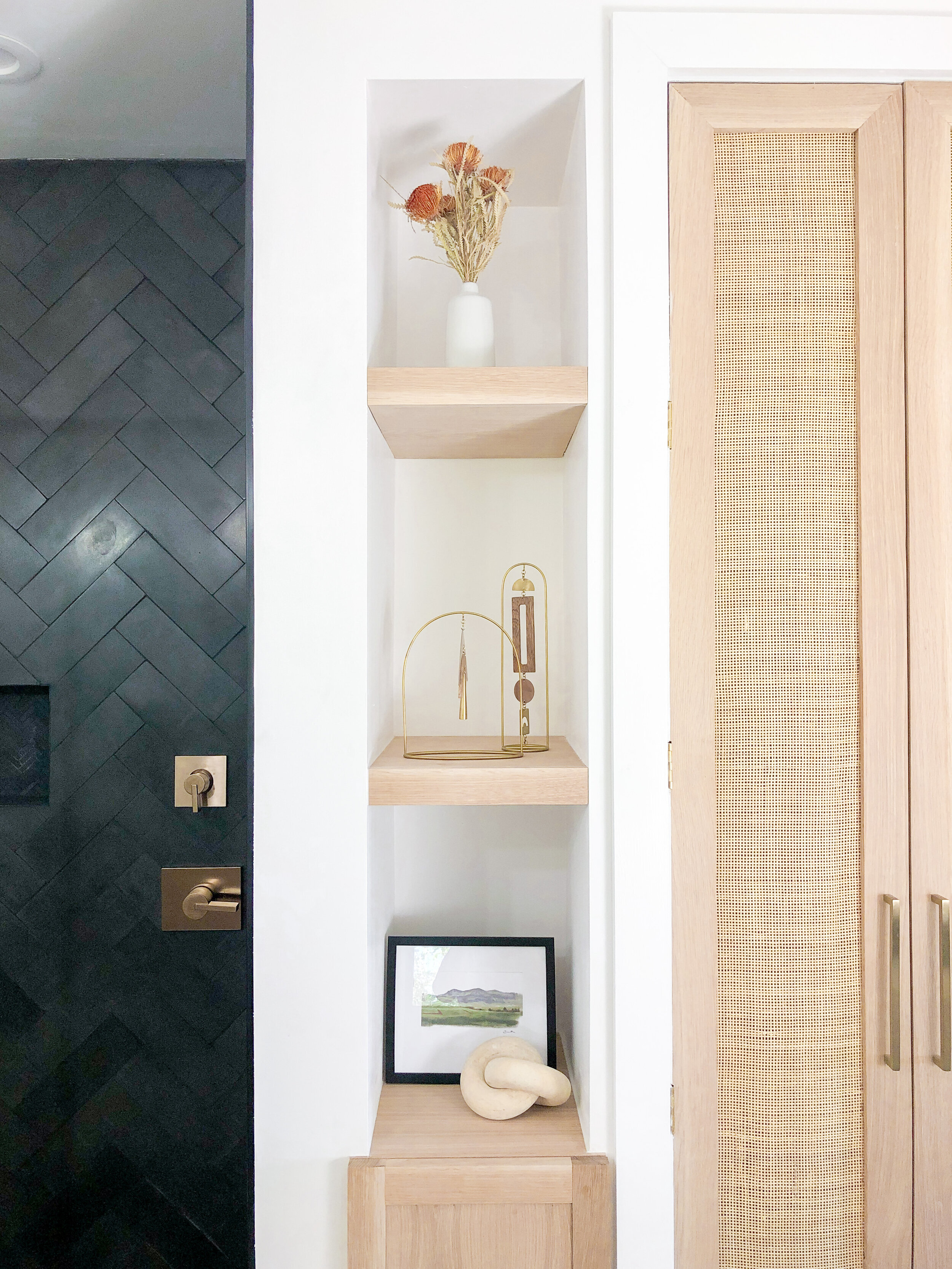
Oh basalt tile while you gave me a run for my money, I am in love. We chose a 4 x 12 Jeffrey Court Basalt Tile and installed it in a herringbone pattern. If you were following along on Instagram, you saw that we had some trouble with discoloration (which was due to some leveling clips I used) and Austin from Allgood Stone Care and Restoration worked a miracle. Phew.
I wanted the height of the ceiling to be accentuated, so we chose to install the tile all the way to the top. This was a doozy to install, but totally worth it. I can’t get enough of the herringbone.
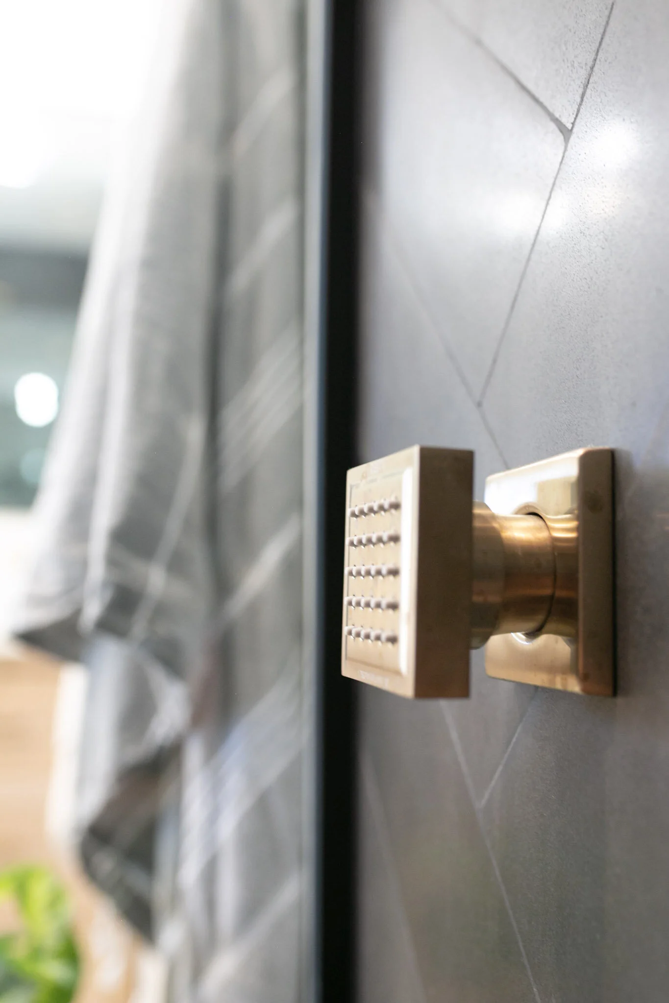
For the shower fixtures, we installed 3 body sprays, a handheld shower, and a rainfall shower head, all in Delta Champagne Bronze. My husband wanted a rainfall shower head, but I find that the rainfall isn’t great for washing my longer hair. So we added a separate handheld shower head. My husband also had the idea of adding shower sprays, and I loved that they balanced out the shower as the tall walls looked a little empty without them.
The shower glass door was custom made and installed by a local company, Akamai Glass, and features a matte black finish. We loved the modern look of the fully framed door, and intentionally installed the diverter and “on/off” right at the entrance of the door, so you don’t have to step into the shower completely and risk getting wet while you turn on the shower. Pretty convenient, right?
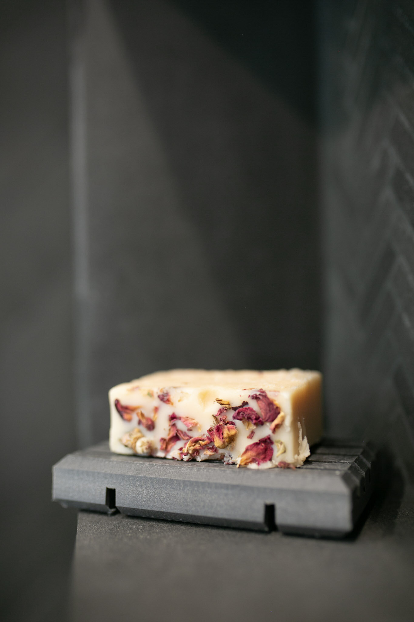
Our shower niche was a design feature, extending almost the full width of the shower. Perfect for cute, decorative soaps like this flowery slice of heaven from Protea.
THE VANITY
The beautiful white oak was sourced from our local lumber company, Architectural Woods Hawaii. We worked with them for all of the wood projects featured in our bathroom such as the closet doors and built- ins, as they had a great selection of woods and plywood . The vanity was skillfully crafted by local carpenter- Virgilio Adaba, and he did a fabulous job bringing my vision to life.
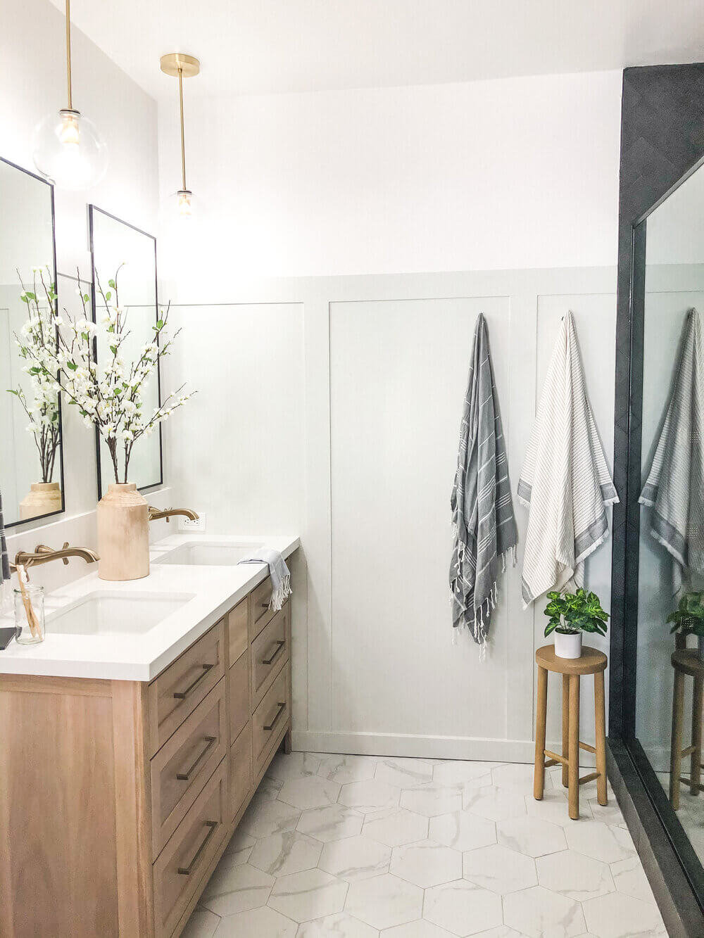
Since we were completely redoing the plumbing for the vanity, I wanted to take advantage of the opportunity to do wall-mount faucets and chose the Delta Stryke Faucets in Champagne Bronze. Our quartz fabricator Patrick James from Pure Stone Hawaii went above and beyond finding me the perfect quartz for the vanity top. I didn’t want anything with veining, because I didn’t want to clash with the pattern on the floor. We chose an 8” backsplash, placing the faucets at a 5” height. Patrick hustled to meet our deadline, and did a pristine job with the installation.
The sleek, modern Skylight Collection from Hickory Hardware was the perfect choice and when paired with the white oak vanity- it was a match made in heaven.
The drawer pulls from Hickory Hardware really tie the aesthetic of the vanity together by coordinating with the faucets and shower fixtures. The Elusive Gold Nickel finish matched incredibly well with the Champagne Bronze from Delta, and we used the Skylight Collection for all of our pulls.
I wanted the mirrors (also made by Akamai Glass) to add some drama to the space by making them exceptionally tall, alluding to the custom shower glass door. Being 22” x 40”, they naturally draw your eye upward to the lovely globe pendant lights from Peared Creation.
BUILT INS + CANE DOORS
We proudly made our own custom cane closet doors, and the caning detail really softens the masculine feel of the shower. You can watch exactly how I built them here, on my YouTube channel, or click one of the images below. This was my first time working with cane, and I love they way they turned out. The hardware is also the Skylight Collection from Hickory Hardware to match the vanity pulls- the combo has me swooning.
The pull out laundry drawers were a thought out feature aiming to combat my husband’s quirky habit of placing laundry right next to, but not IN the hamper. However, now I’m theorizing they’ll just serve as a bigger barrier- time will tell. The “his” and “her” laundry drawers as well as floating shelves were built by Jerry Casino, owner of Innovative Custom Builders. Jerry did a phenomenal job and made them out of white oak to match the custom cane door I made. He was able to complete his project in 3 days to meet our deadline- talk about a life saver.
COLOR
The soft, greige is called "Penthouse" by Clare, and I couldn't be happier with the airy vibe it gives the space.
I can't get over how much I love the color on the walls. I’m not exaggerating when I say that using Clare paint transformed my painting experience. Clare paint is zero VOC. That means they’re free of toxic, carbon-based solvents that pollute the air and pose health risks. I was spoiled with the stick-able samples, and there was no strong odor to the paint which was perfect for painting in a tight bathroom. The board and batten partnered with the subtle touch of color gave the bathroom the beachy hint it needed.
{POKOLOKO} TURKISH TOWELS
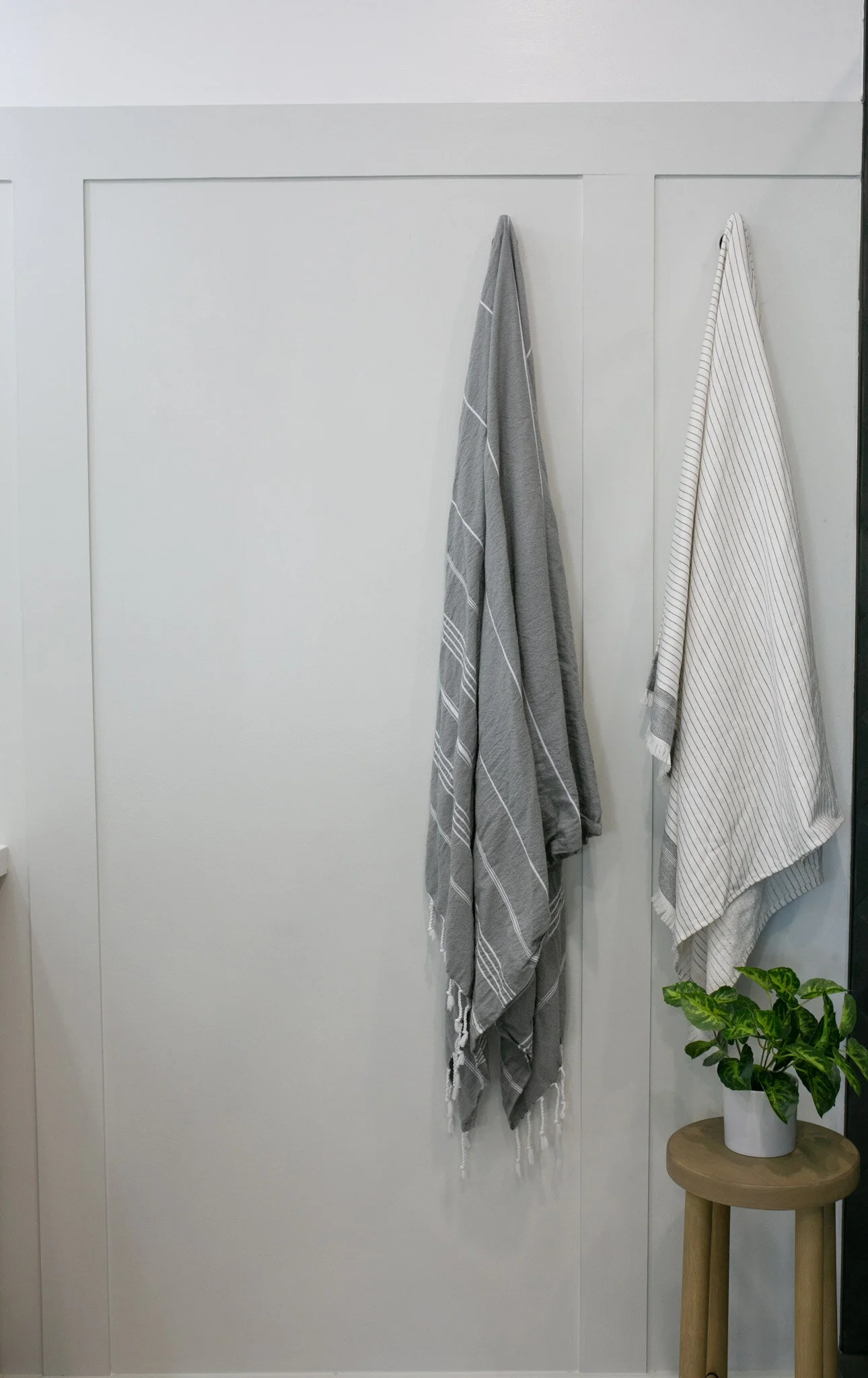
“A little bit crazy. ” That basically sums up how I felt during the 8 weeks of the One Room Challenge (ok, maybe a lotta bit crazy), and that is the meaning behind the name of the fair trade brand, Pokoloko. These soft, contemporary hand towels are not only functionally absorbent and quick-drying, but also totally give the bathroom an elevated, luxe vibe.
When I searched for decor for this bathroom, it was important to me for the furnishings to be eco-conscious and of quality that will last. I’m tired of purchasing decor that only lasts a few months and then needs to be replaced, that is why I went with Pokoloko for our soon to be well-loved towels.
These particular towels by Pokoloko are unique in that they are hand-made and ethically sourced from Turkish artisans. You can feel good knowing that your purchases directly benefit the makers of these towels. You can use code “sachi20” to save 20% off your Pokoloko purchase! You won’t regret it.
DETAILS
The freshly scented, vegan soap bar , recycled soap dish and bamboo toothbrushes from Protea Zero Waste Shop blend in seamlessly and beautifully. Located in Kailua, Hawaii, Protea promotes a zero-waste lifestyle, encouraging us to think deeper about sustainability and producing less waste, without sacrificing the quality of the products we use.
I hope you enjoyed following along during the crazy process. Check out all the other Guest Participants’ reveals here. There is some serious talent out there. If you’re thinking about participating in the Fall ORC, all I can say is- you can do it! I learned a lot during my first ORC, and you can read all about that here. I won’t (hopefully) be making the same mistakes twice. Thanks again for following along, we’ll now rest for a few days before tackling our next big project- our kitchen.
You Also Might Like:

