Project #RaiseTheRoof: THE REVEAL
The Plan Design Plan Adding Skylights Terracotta Tile Tufted Headboard Zellige Tile DIY Fluted Doors REVEAL
Did we cry? Yes. Was there blood shed? Yes. Did we want to give up? Totally. But, we didn’t and boy, are we PROUD to share our One Room Challenge R E V E A L with you. Let’s keep this intro short and get to the good stuff.
Project #RaiseTheRoof: THE REVEAL
A little reminder: T H E S P A C E S B E F O R E
We tackled our bedroom, bathroom, and the hallway that connects the two. We were ambitious, but these three areas were the last unfinished spaces in our home.
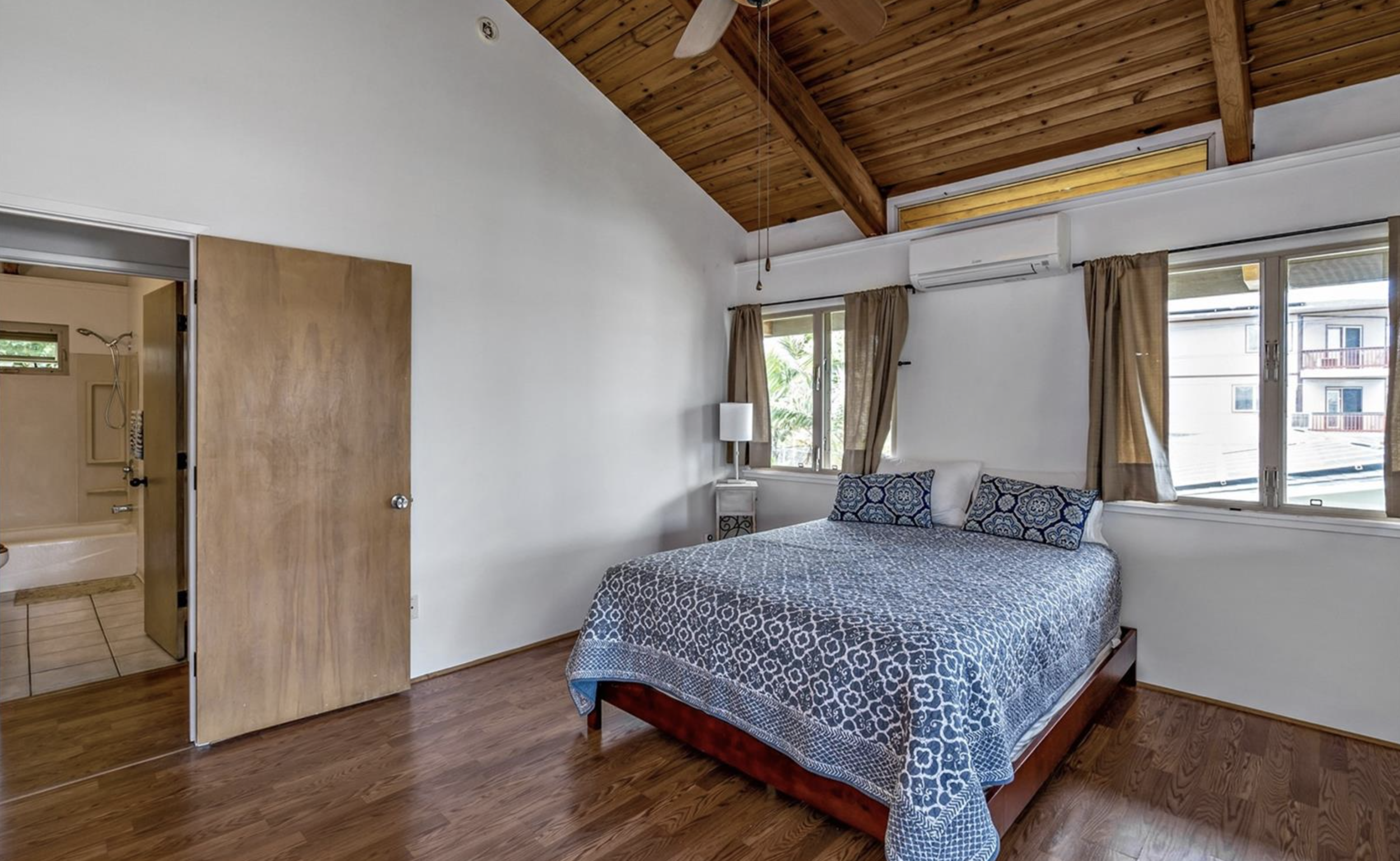
T H E B E D R O O M : B E F O R E
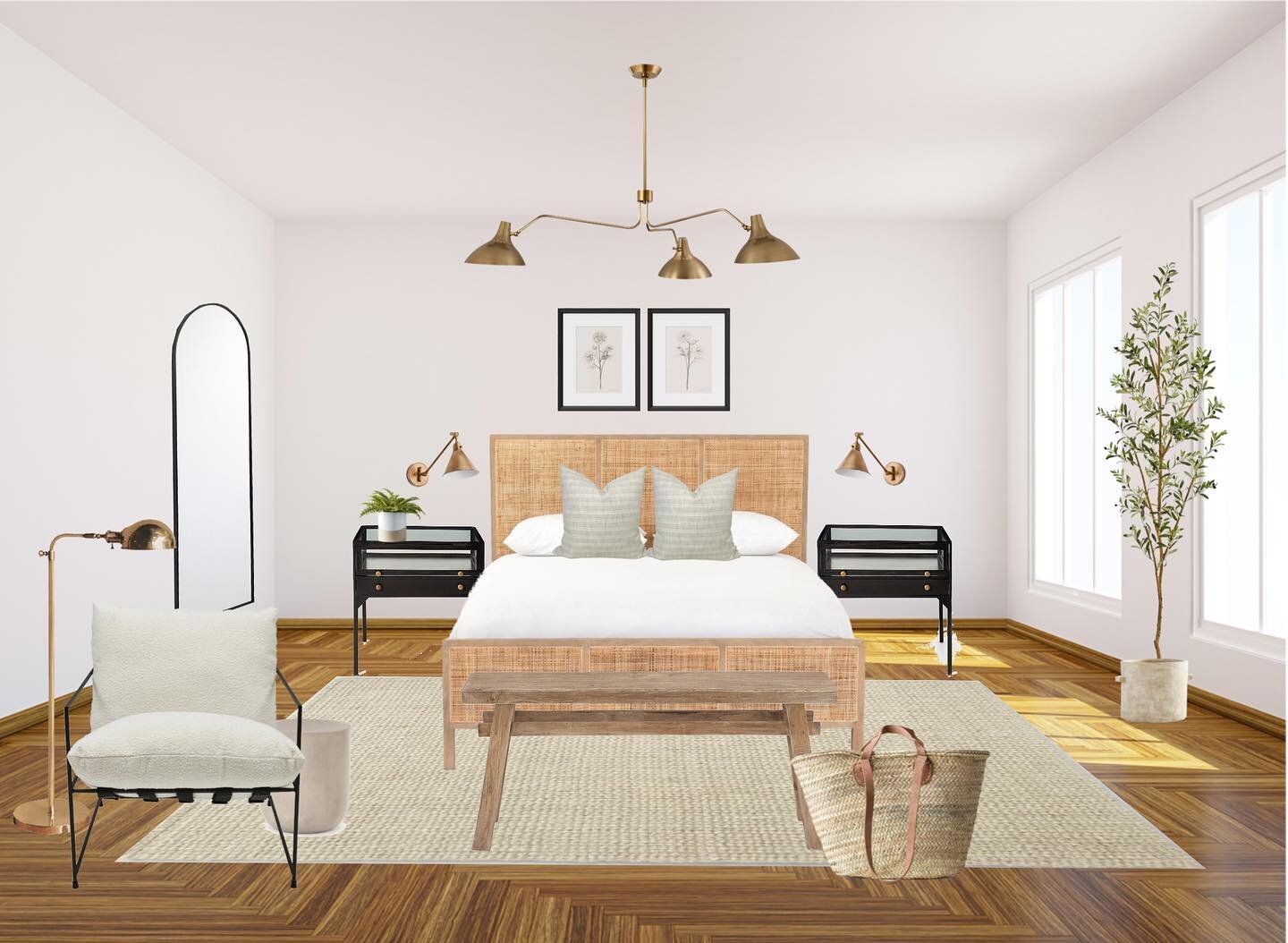
T H E B E D R O O M : A F T E R
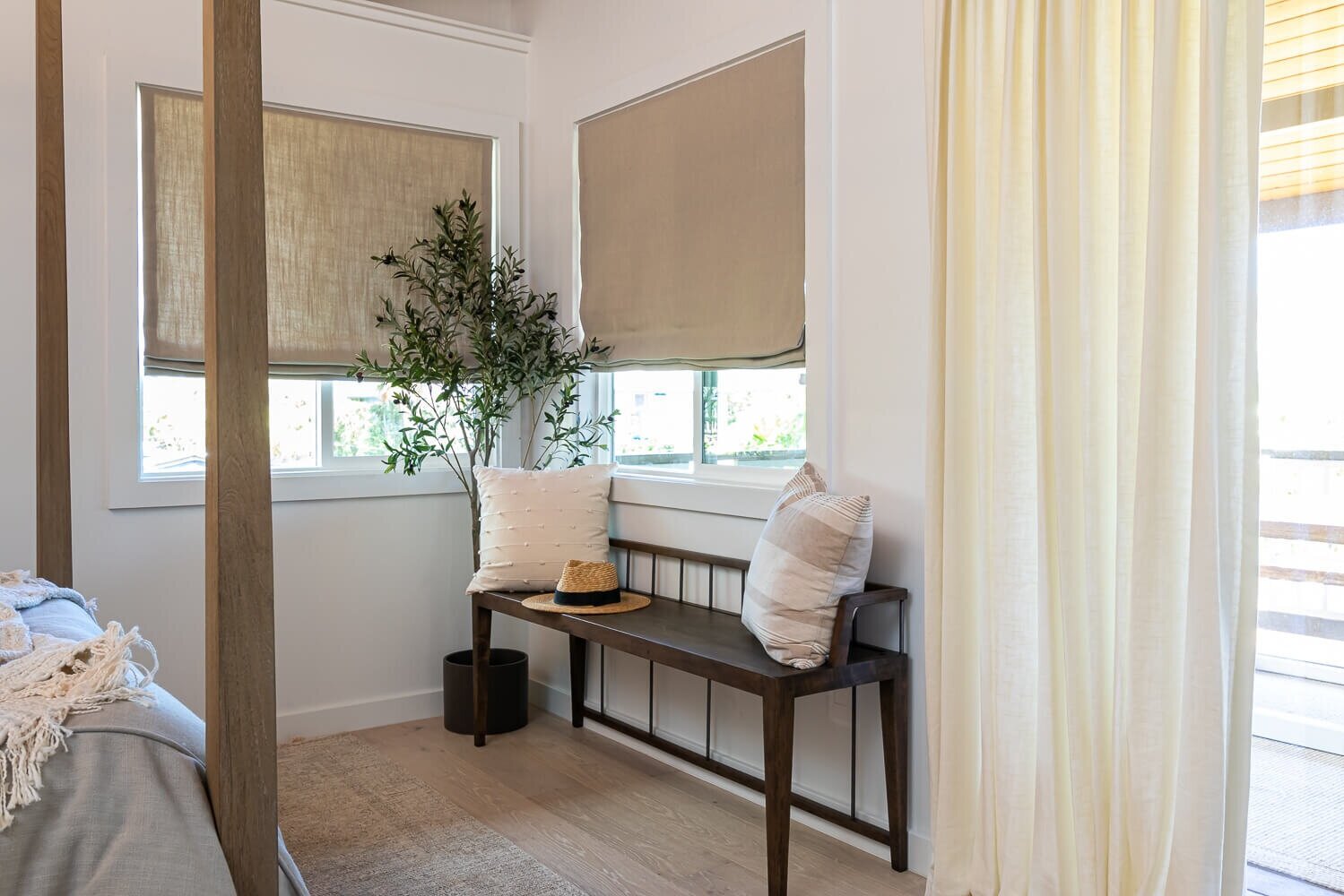
By swapping out the door from left swing to right swing, we were able to take advantage of putting our bed against a wall without any windows. I’ve always wanted a canopy bed, and because of the vaulted ceilings in the space, we gave it a shot - I love it! We also relocated the split AC unit that was in between the windows to a less conspicuous location high up on a different wall, out of view. The flooring got changed to the engineered hardwood that we have in the rest of our house. Isn’t this Loloi Rug just lovely?
Our beautiful roman shades were custom made by Calico.
We did a flat roman shade and custom queen duvet in the same linen fabric by Vern Yip called Emporio. The roman shades added a relaxed, casual feel to my slightly California casual aesthetic. They’re not officially light blocking, but they do a pretty good job in the morning when I’m trying to sleep in. Overall, I loved working with Calico, they were so helpful and easy to work with to create these custom pieces for my space.
I swapped out our curtains for these beautiful 3-finger pinch pleat panels from Trend by Fabricut. I chose the Pacific Linen in Oyster to tie in with the tufted headboard cover. The panels are quick ship, and I went with the two widths option for a fuller look.
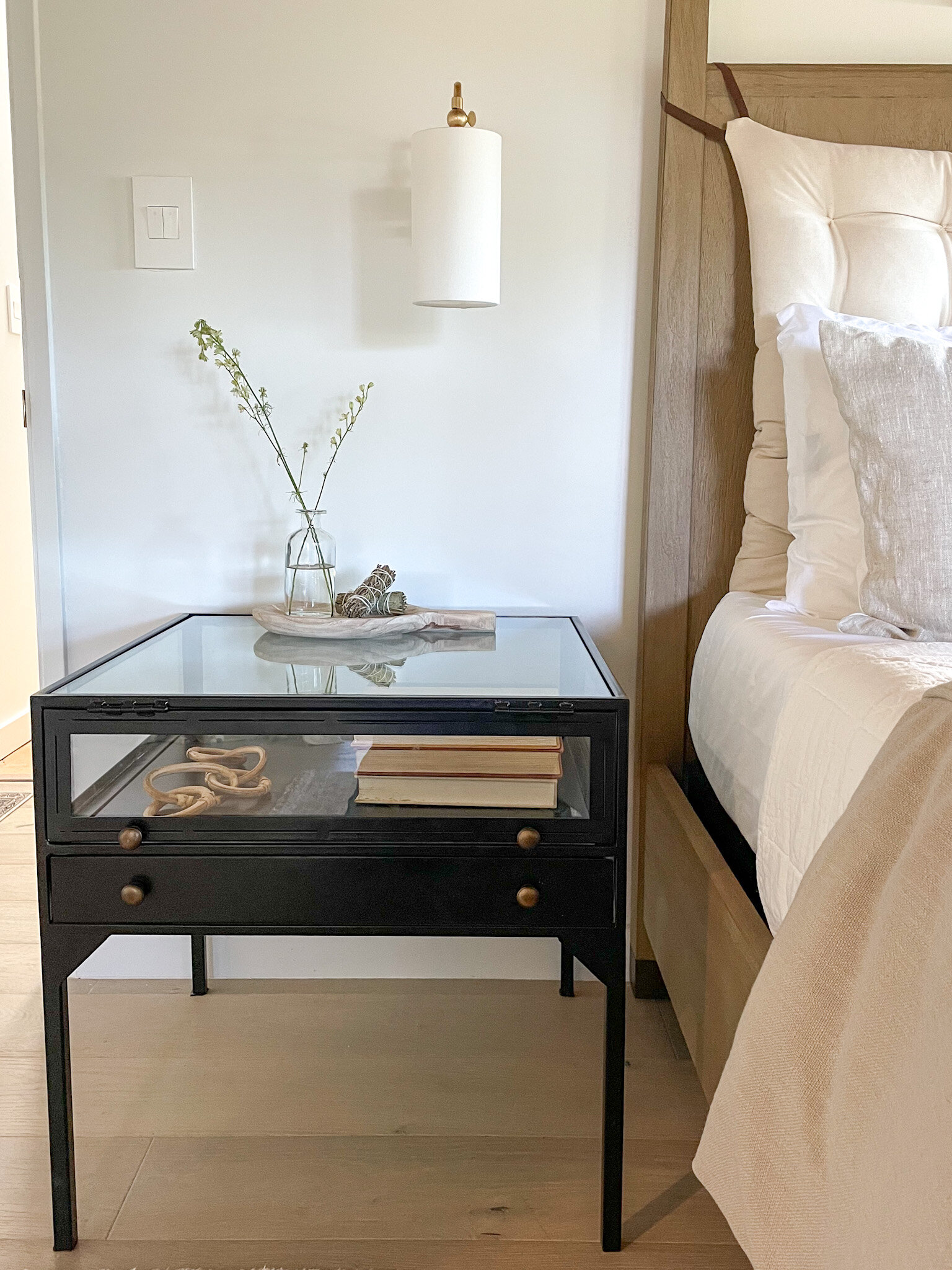
Throughout our spaces we have the adorne Collection Legrand switches and outlets in white. We used the same collection in our kitchen and loved the elevated feel. The pop out outlets are so unique and add a modern twist, and contain 3 plugs - super cool, right? We went with the Legrand Touch Switch in our hallway and it’s incredible. In our bedroom, we have the double paddle switches that control our wall lights and chandelier.
All of the lighting in the spaces are from Hudson Valley Lighting Group, and they absolutely MADE the design come together. It took me a while to settle on the Wayne Wall Sconces for the bedroom, but what sold me was the adjustable/swivel arm as well as the on and off switch each individual light had. No getting out of bed to turn off the light for me! The chandelier is the simple, yet stunning Bailey Chandelier by Mitzi.
The artwork, provided by Minted, is a focal point of the room.
The piece is called “Next To You In Malibu” by Summer Strauch. The colors in the artwork served as the starting point for the entire color palate of the bedroom. It’s the perfect piece for our little beach family. I went with a matte brass frame and the UV- plexiglass that prevents that annoying glare - excellentif you’re going to be taking a ton of pictures in your space!
The tufted wool headboard cushion is by Home of Wool. It’s dreamy! You can get 5% off your order with code 'SACHILORD’. They added adjustable leather straps to the corners and the tufts add just the right dimension. We have a bench cushion from Home of Wool in our dining room and love it, so working with them again in our bedroom was a treat!
The custom accent pillows on the bed were provided by SWD Studio and I just love them! The texture on the queen sized pillows is beautiful. I went with a lumbar pillow in the Surrey Stripe, and queen pillow covers in the Oatmeal Slub Linen. SWD Studio has lots of options for many different styles!
Tuft and Needle provided us their Original Mattress, as we were long overdue. It’s the first foam mattress I’ve ever used and it’s supportive and firm, while being soft at the same time. We also got the Tuft and Needle Percale Sheet Set in white and they are SO soft and cool. I’m thinking about ordering another set in the sand color.
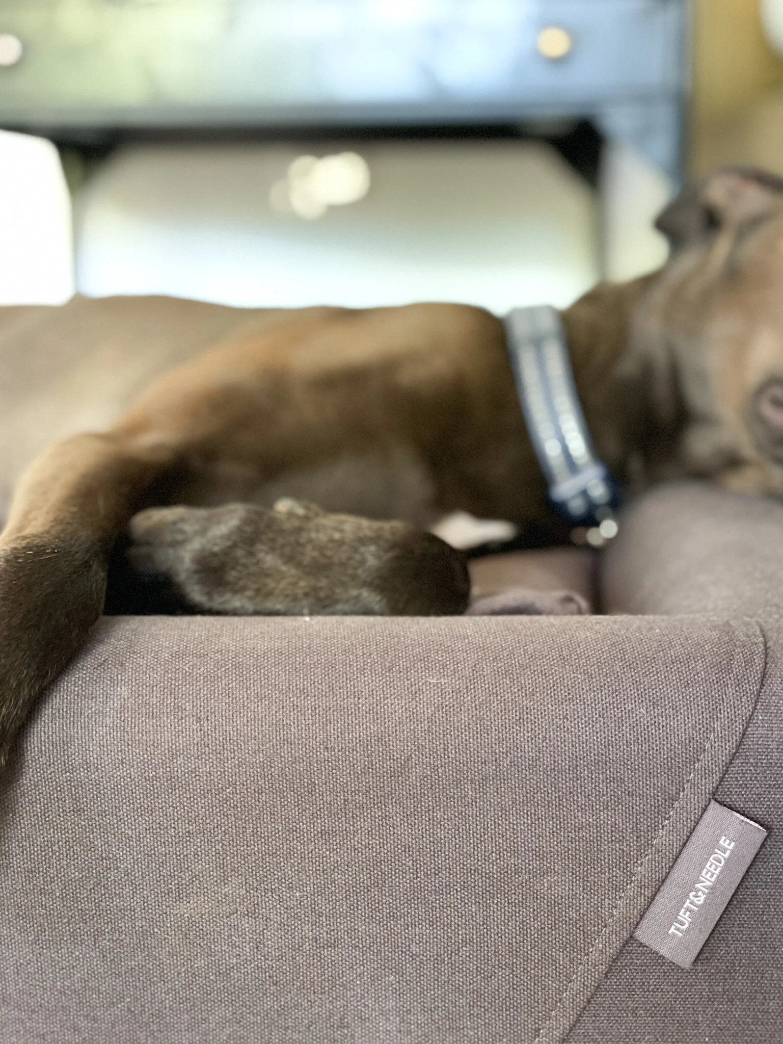
To add an extra layer of comfort, we also chose the T&N Quilt in white. The quilt is cozy, light weight, and comfortable and I think in the summer months, maybe we’ll just use that instead of the duvet! The best gift of the room was the Dog Bed we got in Charcoal, size Medium. One of the biggest regrets I have with our dog Bleu is one, giving him human food during our meal time (he’s quite the assertive food stealer), and two, allowing him in our bed. Over the past week he has slept in his T&N Dog Bed and I’ve only had to kick him out of bed a few times! Which is a win in my book. Thank you Tuft & Needle!
T H E B A T H R O O M : B E F O R E
T H E B A T H R O O M : A F T E R
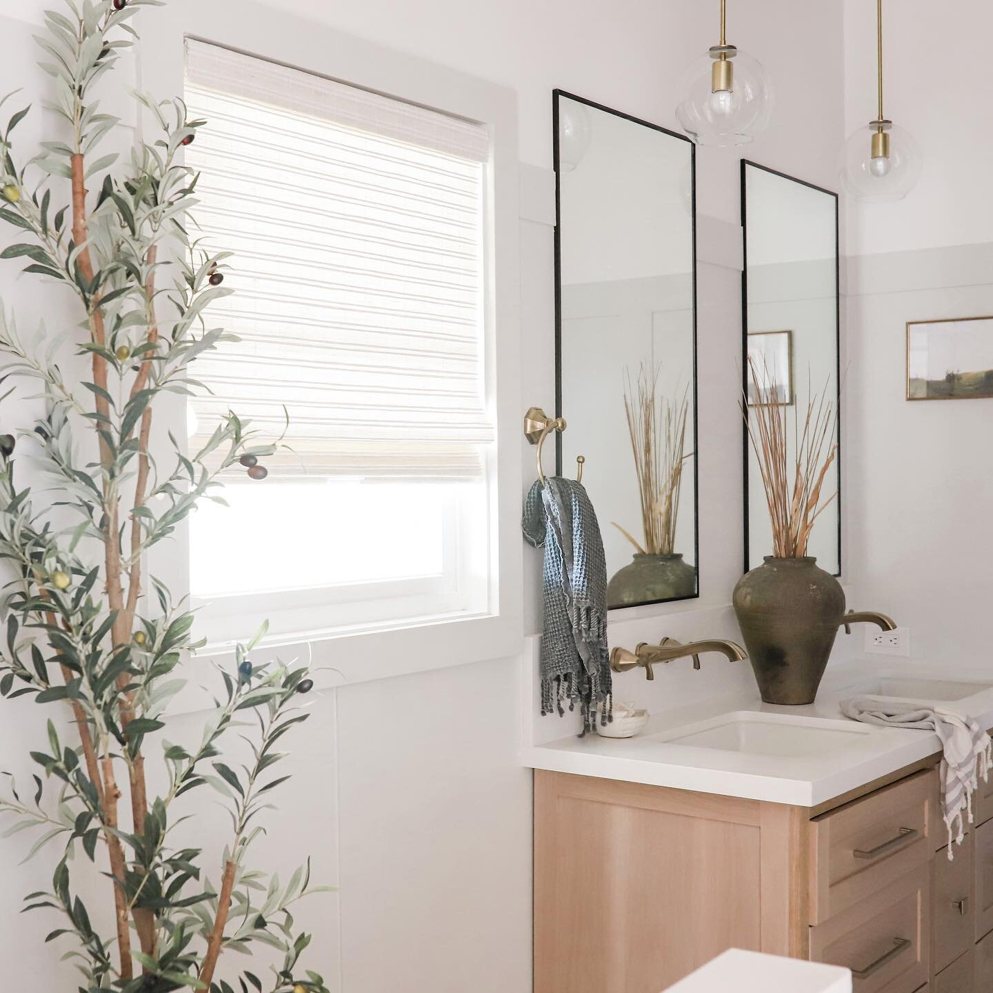
It’s hard to get a good picture in such a tiny bathroom, but these skylights made all the difference! The bathroom felt claustrophobic, but BOOM - once we opened up the ceiling and exposed the vaulted tongue and groove it felt like we had gained an extra 100 sq ft. We added two of the VELUX Fresh Air “No Leak” skylights that fill the room with natural light. You can read all about the process of our installation here.
Let’s talk about the stunning tile from Zia Tile.
For the shower surround is built with the Casablanca 2x6 Zellige. It’s not too stark of a white and the ceiling and terracotta floor pull out the undertones nicely. I added a little twist on the pattern and carried the tile all the way to the new dramatically tall ceiling. The floor tile is a beauty, it’s the Adobe Cotto in Hex. Honestly, the floor tile came out SO much better than I had anticipated. I knew it was going to be good, but not THIS good!
For the shower, we went with the Dolwick Exposed Shower System in Brass from Build with Ferguson and the 60” Sitka Tub also from Build. Paired with the Kingston Brass Heritage Wall Mount Faucet and Destin 20” Undermount Sink also from Build, the touch of vintage that I was going for was achieved. The vanity was custom made locally and we added the simple, yet elegant Schuab Satin Brass Cabinet Knobs. I wanted two on each drawer to add a feminine touch, and the brass knobs matched nicely with the faucet. Schuab has a lot of beautiful options, it was hard to pick!
Overall the simplicity of the Brass Cabinet Knobs was what the space needed. I owe a special thank you to Richie and All Things New for setting us up with subcontractors, and for generously helping us with the plumbing for our bathroom. We couldn’t have done this without you!
We used Hudson Valley Lighting throughout our spaces but my favorite would have to be the Saratoga Wall Sconces. Aren’t the alabaster domes just dreamy?
A huge thank you to American Floor and Home for helping us with the LG Brushed Carbo quartz vanity top as well as the fabrication and installation. If you’re local on Oahu, definitely swing by their showroom to see what they have to offer for your renovation projects! I have been dreaming of a 8” drop down skirt FOREVER and I can’t believe we were able to make it happen in our bathroom! I wanted a soapstone look and the LG Carbo is absolutely perfect. The brass pops against it and the white oak gives it some contrast.
Also, thank you to Live Beautiful Home for providing so many of my styling items for these spaces! Isn’t that large vase to die for?
With all the newness in the space I wanted something that added an aged, classic feel.
We used the Emtek Conical Knurled Knob in un-lanquered brass for our utility door and our laundry doors. I loved how the detail on the knob complimented the fluting (spoiler alert - it was actually chair rail moulding) we added to the doors from Novo Building Products. For the doors to the bedrooms and bathroom, we used a matching Emtek L-Square Straight Knurled Lever also in un-laquered brass. I am SO excited to see how these age and turn, it’ll be a perfect addition to the handmade, natural feel I have going on with the shower and floor tile.
The hallway getting completed was just the cherry on top. The hallway lights got upgraded with the Hudson Valley Lighting Group Randolph ceiling lights and the Loloi rug added depth to the light palate. We also fluted the closet doors to the laundry area and added Emtek Conical Knurled Knobs to match the utility closet.
That’s a wrap, friends! I can’t WAIT to go check out everyone’s reveals. Congratulations to all who participated, whether you finished or not, you deserve to be proud of yourself! THANK YOU so much to Linda and the Better Homes and Gardens team for making my dream of being a Featured Designer come true. Also, of course, a HUGE thank you to our amazing Official Sponsors and of course YOU GUYS for following along and supporting us along the way. We couldn’t have done it without your encouragement. Alright, let’s go check out everyone else’s rooms!
Ariene C. Bethea | At Home With Ashley | Banyan Bridges | Bari J. Ackerman | Brit Arnesen
Brownstone Boys| Cass Makes Home | Dominique Gebru | Gray Space Interiors| Haneen's Haven
Home Ec. | Nile Johnson Design | Pennies for a fortune | Prepford Wife | Rachel Moriarty Interiors
Susan Hill Interior Design | This Is Simplicite | Tiffany DeLangie | Victoria Lee Jones

